Good design in 2024 is all about the details and how every little element helps attract visitors.
Time revealed that “Average screen time for adults in the US and other countries is up 60–80% compared to before the pandemic.” Like so many other things in the world, a healthy approach depends on our ability to be aware and set limits. However, the offending font can also be adjusted. In the case of the digital world, more tools are being made available to help users maintain their well-being.
For example, some apps offer timers to help users know how much time they spend on the platform. Instagram provides these tools as well as resources to help parents help their teens communicate only with people who have no intention of harming them and to limit the amount of time they spend. Another example is the Android operating system, which includes tools to help users understand how much time they spend in each app and on their phones in general.
Digital wellbeing can be achieved in many other ways, from timers that alert knowledge workers that it's time to step away from the computer and stretch to calming screen colors that help calm users throughout the day. Some apps are designed to help with well-being, focusing on meditation, sleep, nutrition and drinking enough water.
Handmade graphics
Hand-drawn graphics are a response to the overuse of images from services like Canva and Adobe Stock. This content can make design faster and easier, but it can also be problematic—sometimes even cringe-worthy—in the way it represents certain groups of people, the sometimes silly design elements, and the potential for major mismatch with your brand. .
On the other hand, handcrafted elements can be designed to perfectly support your brand and express the messages you want to send about people and topics. They can also add style to a website or app, potentially attracting viewers and customers and giving them a reason to return. Shakuro’s post notes, “These visuals create a solid bond with consumers based on emotional connection. People will recognize the product just by looking at the images, as if the brand were their old friend.”
Microinteractions
Microinteractions are small but important events when customers use a website or app. One of the simplest examples is the Like button, introduced by Facebook and today a common element in many online environments.
Other examples include a scroll bar to show how advanced you are in an article; the jumping dots that appear when someone is messaging you, to let you know they are responding; a progress bar to show how advanced the download is loading; or a fun error page message that appears when a requested website page fails to load.
These interactions provide a higher quality user experience, reassuring website and app users that their actions are having an effect and that something is happening. Designers are finding more creative ways to use them to enhance this experience.
Cross-device UX
More customers are now switching devices to use the same website. For example, a user might start a search on their favorite ecommerce platform while they are on their phone during a train ride to work and complete the transaction at their desk when they arrive. This means that to provide a smooth transition, designers are ensuring customers have a seamless experience no matter what device they are using.
Cursor Design
Everyone is familiar with the standard cursor design, like the ubiquitous white arrow used to move around the screen and the familiar hourglass to show that a process is in progress. However, designers are using more interesting and whimsical cursor designs that complement the sites and brands they are used for. Designers can even create custom cursors to provide customers with a fresh experience.
Accessibility
Accessibility is increasingly becoming a requirement. A prominent example is the European Union's adoption of the European Accessibility Act, which requires digital environments to comply with accessibility standards. These standards apply to computers, operating systems, smartphones, e-commerce sites, e-books, and banking services such as ATMs.
Specific features include voice search, which allows for a more hands-free experience, contrasting colors to help people with visual impairments, adjusting text size to be easier to read for all viewers, and video captions to support people with hearing problems .
All of these resources help seniors and people with disabilities have access to more products and services. Designers must familiarize themselves with the guidelines and ensure that all designs comply.
Cards
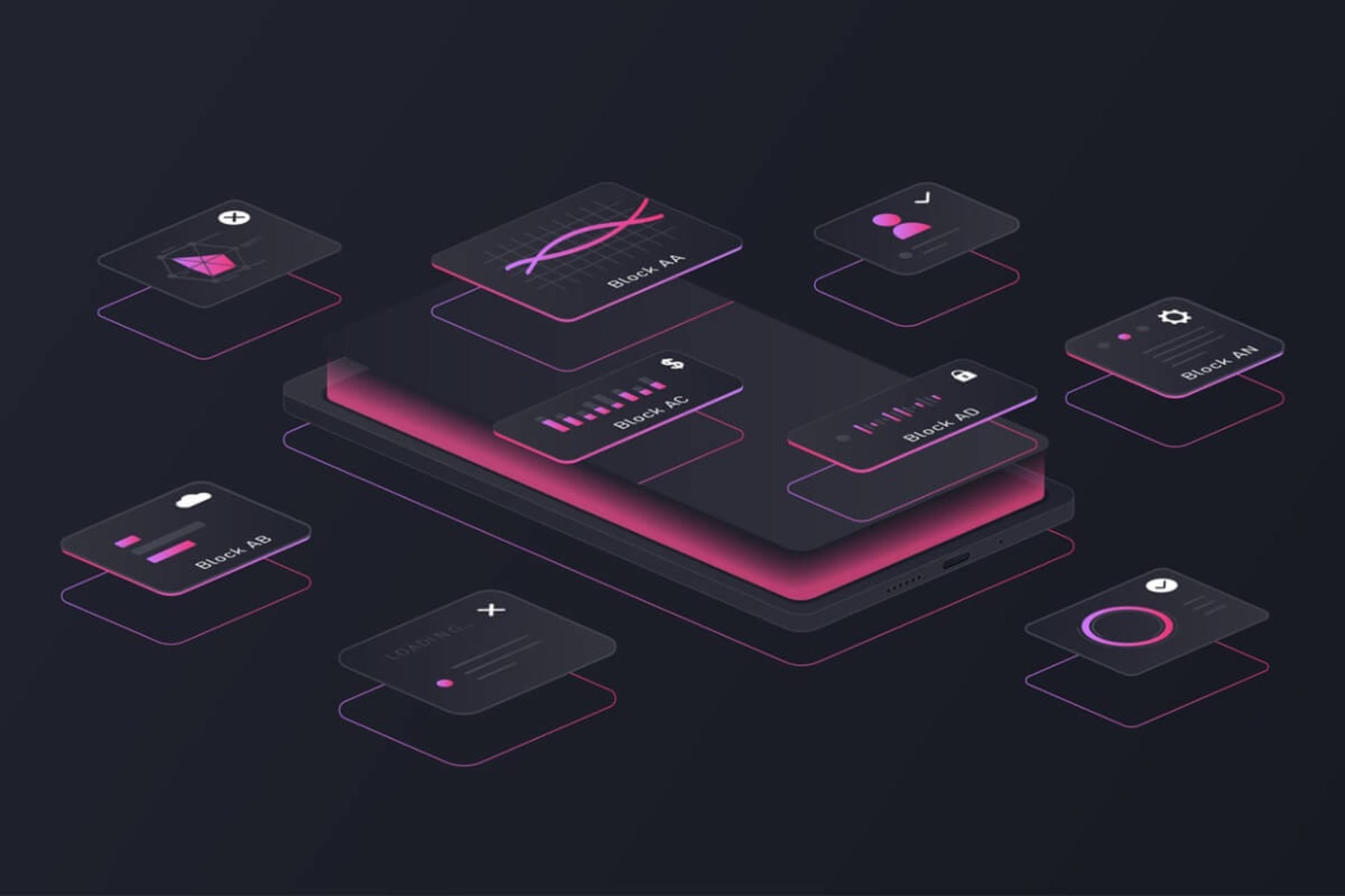
Cards can be used in website design for a variety of purposes. They can include product previews, blog post teasers, videos, images, tips, and many other types of content. The flexibility of cards makes it easier to design and organize information on a website.
Immersive scrolling
Something as mundane as scrolling might not seem like a design element, but it definitely can be. Over the years, the way scrolling occurs has changed from a simple static movement, leading the viewer through content in a specific way, to a much more dynamic presentation that allows exploration and movement around the site in a more intuitive way.
With immersive scrolling, designers can showcase products in detail. Immersive scrolling is also called scrollytelling when it displays content with a narrative focus. These presentations may involve animations and other dynamic elements against a backdrop of static images. This scrolling method is highly engaging and attractive, giving viewers a reason to return to the site. It's likely that designers will continue to experiment with this method, but it's only for some sites, so caution is warranted.
Dark Mode
Devices like smartphones may have a dark mode setting, typically used at night to help users see more easily. Some simply prefer this to the standard light setting. At the same time, more apps are being designed with dark mode because it's easier on the eyes, causing less eye strain than bright backgrounds. Twitter is a major platform that has jumped on this trend, and more designs are likely to include it in the coming year.
3D images
3D images provide users with an interesting, interactive, and more immersive experience than 2D images. Some 3D presentations provide the basis for powerful storytelling and allow viewers to feel like they have interacted with objects in real life. But even simple 3D add-ons to still images can stand out and be more memorable. As with other design elements that really stand out, a little goes a long way, so designers should ensure they're supporting key messages and functionality rather than overwhelming them.
Mobile-first design
In the past, designers developed websites on desktop or laptop computers and then created a mobile version. But because mobile devices drive the majority of online traffic, designers should think about creating websites from a mobile-first perspective and then developing versions to accommodate other types of devices. Using responsive design can help ensure that regardless of the device used, viewers receive a similar high-quality experience.
VR
Many websites and apps are the perfect places to use virtual reality (VR) technology to help users have a higher quality user experience. While gaming is an obvious example of where this technology can be deployed, there are almost limitless uses for it in other domains as well. For example, real estate agents can use it to show houses to interested parties without them having to travel to the location of the house. Educators can use it to bring users into the historical periods they are teaching about. And retailers can use it to showcase all the details of their products.
Augmented reality is a related technology that can also be highly useful. For example, a museum might create an app that provides visitors with information about items as they approach them and guides them through the collection in a logical way.
Biometric access
While passwords have played an important role in the rise of the digital world, they are becoming more complicated. Many people use easy-to-guess passwords and repeat their use, two basic no-no's that make hackers' jobs much easier. Password managers like Dashlane can help, but they don't offer any security guarantees.
Passwords are also becoming less necessary as new solutions emerge. Biometrics include fingerprint and facial recognition, while technological alternatives include physical access keys or authorization numbers sent to the user's mobile device. Rather than being used as add-ons, these options are more often incorporated into website and app designs.
Immersive Experience
Websites for companies with interesting products highlight them with immersive experiences that allow visitors to really get a feel for what those products are like. Automakers are a good example of this, with detailed presentations of all aspects of the vehicle, including the dashboard and engine areas. Large font sizes and large images contribute to the immersive approach.
UX and UI choices depend on the target market
As this list makes clear, good design in 2024 is all about the details and how every little element helps attract visitors. But the key to success in doing this is public awareness. For example, flashier elements like bright colors and engaging, eye-catching scrolling can attract more younger, active viewers. At the same time, subtle tones and a more self-guided approach may be better for older target markets or those who prefer a calmer experience.
Likewise, hand-drawn graphics, alternative cursor designs, and anti-design elements may excite some viewers but confuse others. But some elements will likely have universal appeal and some may even go unnoticed by users. For example, microinteractions and personalization may not seem like design elements to some, but simply an expected functionality.
To achieve the best results and highest UX quality, designers must be aware of the user's perspective and be prepared to change some elements based on feedback and usage results.


