
Discover how combining Nuxt.js with Tailwind CSS can result in fast, visually stunning web development.

In the evolving landscape of web design and development, efficiency and aesthetics go hand in hand. With tools like Nuxt and Tailwind, you can achieve a perfect combination of both by leveraging the right CSS file structures. Welcome to our tutorial on 'Simplify your design with Nuxt and Tailwind'. Whether you're an experienced developer familiar with the Nuxt community and Vue development services or a beginning designer just starting to explore tailwind classes, this guide will walk you through the steps to integrate these powerful tools. By ensuring your websites are not only visually appealing with dynamic data attributes, but also optimized for performance, you will be equipped to enjoy the best of both worlds. Dive in and discover the synergy of Nuxt and Tailwind!
What is Nuxt.js?
Nuxt.js is a free and open-source framework built on top of Vue.js. It's quite opinionated, especially when you compare it to React's Next.js. This robust tool allows developers to install dependencies from their repository and create enterprise-grade Vue.js applications with SSR (server-side rendering) capabilities. Nuxt.js comes with file-based template paths, code splitting, automatic imports, SSR-compatible data fetching utilities, TypeScript support, and out-of-the-box Vite building tools.
But what is server-side rendering and why is it good?
In layman's terms, with frameworks like Nuxt.js and Next.js (for React developers), developers can write full-stack applications without creating an online module server via Node.js, Express.js, Nest.js or any other language or frame. SSR allows us to write everything related to our applications within the same codebase, in the same project. SSR is also very good for SEO (search engine optimization), faster initial load time, much better performance with low-end devices, and easier caching.
What is Tailwind CSS?
Tailwind CSS is a highly popular CSS framework that helps developers write faster, more readable, and maintainable CSS code. With its unique tailwind configuration, customization becomes a breeze. While Nuxt.js already provides its own CSS section in the component, facilitating smoother development server configuration, Tailwind CSS integration offers a different approach. It may seem daunting at first, but it greatly increases developer productivity once they get past the initial learning curve.
In the following tutorial, we will create a Nuxt.Js project from scratch, add Tailwind CSS to it, and build a simple blogging application. Instead of focusing on the logic, let's focus on how to use Nuxt.js and Tailwind CSS together.
How to install Tailwind CSS and Nuxt.JS
To start integrating Nuxt.js with Tailwind CSS, make sure you have all the necessary repository installation dependencies. Start by installing Nuxt.js. After installation, it is crucial to check peer dependencies. Once everything is configured, you can proceed with configuring your development server. Use the following terminal command to initialize your project:
npx nuxi@latest init <project-name>
Here, instead of the project name, you may want to write your project name, in our case it is nuxt-tailwind.
After installation, we need to go into this directory and run npm install or yarn to install the dependencies.
So, we need to install Tailwind CSS so we can use it with Nuxt.js. Now, official documentation can sometimes cause problems. But the method we are going to follow is working perfectly at the time of writing. Let's add Tailwind CSS as a Nuxt.js module. To do this, within the directory we just created with nuxt CLI, we will enter this command in the terminal
yarn add -D @nuxtjs/tailwindcss@latest
Next, we will go to the nuxt.config.ts file and change its contents with the following:
 //
 export default defineNuxtConfig({
  devtools: { enabled: true },
  modules: ("@nuxtjs/tailwindcss"),
 });
Next, we will start Tailwind CSS by running `npx tailwindcss init`
Create the Main.CSS file
After doing this too, we will create two new folders and a new main.css file and place the following code in it:
 @tailwind base;
 @tailwindcomponents;
 @tailwind utilities;
And this is the route of our newly created main.css file: ./assets/css/main.css
Now, if we run the application by yarn or npm run dev, we can try to test whether our installation was successful or not.
Test the Nuxt Tailwind installation
To test it, we can access the app.vue file and replace its contents with the following:
 <template>
  <h1>
    Hello world!
  </h1>
 </template>
Now, if Tailwind's CSS rules are applied, we should see this screen:

Building the project: a blog site called Jingles
The best way to learn is by practicing. Now that we know what Nuxt.js is, what Tailwind CSS is and we've already configured and run our application, it's time to build something for it so that the knowledge stays with us. Now, before we begin, if you've never used CSS in JS like Tailwind CSS before, the way it approaches styling may seem confusing, even daunting at first. Here it is important to remember that we only move forward when we find ourselves in an unfamiliar situation. So after this tutorial, Tailwind CSS should make sense to us and we should be able to use it in our projects.
One last thing before we get started, remember that when learning a CSS framework like Tailwind CSS, we will be making heavy use of the official documentation. We're not trying to memorize anything, because we don't need to. The official documents are very good and we can easily search for whatever we want.
Let's start by building the navigation bar for our application. Keep in mind that for heuristic reasons this app will not be mobile responsive. Let's just focus on the desktop version of it.
Building the NavBar
First things first: we will create a components folder and place a navbar.vue file inside it. So, in our app.vue file, we will import it like this:
 <template>
  <navbar />
 </template>

 <script>
 import navbar from "./components/navbar.vue";
 </script>
Now we can go back to navbar.vue and start writing code. In the templates section, we will use flexbox to achieve the desired result.
Let's add the following div:
<div></div>
In this div, we are doing the following:
-flexible display
-justify content to space between so that elements within it are spaced on opposite sides of the div
-align items to the center
-make the screen full width
-give a background color of #d60068
-give 5px padding on all sides
See, this is how we write CSS through Tailwind CSS. If you already use Vue.js, you know that Vue.js comes with its own styling section where the developer can write CSS directly into the component. In CSS in JS, we do not give class names to elements like divs, but instead we write the desired CSS classes directly inside that element as a class name. Here, by writing flex and justify-center, we are telling Tailwind CSS to apply the display:flex and justify-content:center classes to this div. How do we know how to implement the Tailwind CSS class and for which CSS class? Simply referring to official documents.
Now there are many classes there, as always. When developing or reading code, we don't need to look for the class name of the element and then find the class tag corresponding to the class name and read the CSS from there. Instead, we can read it directly from the element itself. That's the beauty of CSS in JS.
We want to add four elements inside this navigation bar, one of them aligned to the left and three of them to the right. We will use flexbox again and create two divs. The first div will contain the element on the left, and the second div will take three more elements within it, to be aligned on the right with some space between them. As you can see, we are layering our visual plan in flex boxes. Now inside the previous div, we add the following snippet:
  <div>Jingles</div>
      <div>
        <router-link to="
        <router-link to="/about">About</router-link>
<router-link to="/contact"
 >Contact</router-link
 >
 </div>
 </div>
What we're doing here is, with the first div, which is the left-aligned element that contains the Jingles text, we're giving it an xl text size, and a bold font weight.
Next, we are creating another div container, which will contain the three elements on the right. In this container div, we are again starting flexbox by writing flex, justifying the surrounding elements so they have some space between them, and giving it a width of 5/12 of the containing div.
Inside it, we have three router link items that we haven't created yet, but that will take us to their respective endpoints once we create them, and just give the last one some styles, giving it a black background color, a white text color , a padding of 2px on all sides, and a border-radius of 2xl (plenty).
And that's it. We have successfully created our app's navigation bar. Now, let's create the hero section.
Building the hero section
Now, as we did with the navigation bar, let's create a hero.vue file inside the components folder and import it into our app.vue file.
 <template>
  <navbar />
  <hero />
 </template>

 <script>
 import navbar from "./components/navbar.vue";
 import hero from "./components/hero.vue";
 </script>
So we will go to the hero.vue file and start writing the code. Here we want to have three elements on top of each other, and since this is the browser's default behavior, we don't need to use flexbox here. Let's look at the following excerpt:
 <template>
  <

  >
    <div>Stay Hungry</div>
    <div>
      Lorem ipsum dolor sit amet consectetur adipisicing elit. Repudiandae,
      accusantium eos dolores quer porro doloremque culpa reprehenderit
fugiat modi commodi numquam exercitationem id voluptas tempora. And the
 illnesses minus maximum velit.
 </div>
 <div>
 <button>Start reading</button>
 </div>
 </div>
 </template>
What's going on here? First, in the div container, we are providing a full height with the h-full command. This full does not mean full screen, if we wanted it to take up the entire screen we would say h-screen, instead we are saying it should contain the elements within it and expand accordingly. So we have w-full, honestly, here we could just as well say w-screen and that wouldn't change anything.
As we did before, we give the background color with the bg command. Then we have the py-5 and pl-10 commands. They are related to padding. The first means giving a padding of 5px from the y-axis, that is, from the top and bottom. And the second says to give it a padding of 10px from the left. Then we give it a black text color and a black border with a width of 1px. See, it seems confusing at first. But the more you write Tailwind CSS, the more these classes stick in your mind and the faster and more productive you become.
Inside this div, we have three elements: a title, a body of text that is lorem ipsum, and a button that says start reading. For the title, we give text of 7 xl and a bottom margin of 5 px with the mb-5 command. We do something similar with lorem text, but give it a 2xl font size. The button has a black background, white text, 2px padding on all sides, and is rounded.
And that's it. We have successfully created the hero section of our app. Now, let's create some articles for our application.
Building the articles section
We want to add at least four articles to our app. For this we will use props because we don't want to write everything by hand. As they say in software development, a rule of thumb is DRY code (don't repeat yourself).
Now let's create a new article.vue file in the components folder and add this snippet inside it:
 <!-- components/article.vue -->
 <template>
  <div>
    <div>
      <h2 > {{ title }} </h2>
      <p> {{ content }} </p>
    </div>
  </div>
 </template>

 <script>
  export default {
    props: {
      title: {
        type: String,
        required: true,
      },
      content: {
        type: String,
required: true,
 },
 },
 };
 </script>

 <style></style>
Here we are creating the template for the articles we will display. Now you know that m means margin and p means padding, for background we write bg and by writing text-xl we are giving the text a larger font size. But we're doing something else too, something we haven't done before, we're making use of the scripts section, which deals with javascript logic.
Here what we are using is called Options API in Vue.js terminology. There's also a newer Composition API, but we'll stick with the old, well-known Options API for this tutorial. If you're a React developer looking to switch to Vue.js, the Composition API might be a better fit for you, but if you're a beginner, the Options API is also solid.
We are defining props, in props we have title and content. We provide their types and whether they are mandatory or not. And within our template section, we are using “mustache syntax” to display the article title and content. The mustache syntax is the double braces you see in the template section. It is used to display script section data.
Now, let's import this component into our app.vue file and use it to display some articles.
 <template>
  <navbar />
  <hero />
  <div>
    <

      v-for="(article, index) in articles"
      :key="index"
    >
      <article :title="article.title" :content="article.content" />
    </div>
  </div>
 </template>

 <script>
  import Article from "~/components/article.vue";
  import navbar from "./components/navbar.vue";
  import hero from "./components/hero.vue";
  export default {
    components: {
      article,
navbar,
 hero,
 },
 date {
 return {
 articles: (
 {
 id: 1,
 title: "Article 1",
 content: "Content of article 1...",
 },
 {
 id: 2,
 title: "Article 2",
 content: "Content of article 2...",
 },

 {
 id: 3,
 title: "Article 3",
 content: "Content of article 3...",
 },

 {
 id: 4,
 title: "Article 4",
 content: "Content of article 4...",
 },
 ),
 };
 },
 };
 </script>
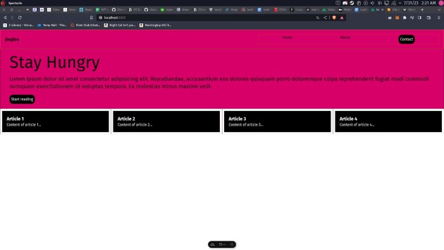
As you can see, we added a lot of things here. Until now, importing and using components is no secret to us. In addition to our general workflow, we have the data method in the Options API, this data method handles the component data. And we are doing this by creating an array of objects called articles and adding the necessary things we want inside it. We have the id, title and content. You may remember that in our article.vue file we were using title and content for display purposes.
Now in the template section, in the hero component, we have two divs and the Article component that we have imported. The reason we are creating two divs is that we want to make use of flexbox and instead of aligning the articles on top of each other, we want to align them side by side, thus starting the flexbox in the first div of the container.
So, inside this div, we have another div that has the class tags border, border color and width full. In Tailwind CSS, if we want to add a border to an element, we first need to start the border by providing the border keyword which is followed by how we want the border to be styled.
After that, we have a v-for keyword, which is Vue.js specific way of looping through elements. As you can see, it takes the article and index properties in the articles object array, provides the index as the key by the command :key=”index”, and for each element within the articles object array, it creates a new Article component. . Here too, to pass the props, we need to set :title=”article.title” and the content in the same way. Now, our application should look like this:
Conclusion
Concluding our Nuxt and Tailwind tutorial, this combination clearly provides an efficient and elegant solution for web design. In projects that require high performance, simplified designs, and SSR capabilities, a Nuxt application truly shines as an exemplary solution. However, for very simple sites or sites without a focus on dynamic content, this may be overkill.
Although both Nuxt and Tailwind come with a learning curve, it is a worthwhile investment. Tailwind's modularity allows users to extend its functionality with plugins, and Nuxt's flexibility offers vast opportunities to document and customize web solutions with precision.
Considering the industry's shift toward component-based architectures, many companies now outsource Vue development. With the popularity of new frameworks like Vue and utility-first design, there is a compelling argument that these tools will continue to be significant in the times to come. By adopting them today, you position yourself at the forefront, prepared to shape the next wave of web innovation.
If you liked this, be sure to check out our other articles on web development.
- A Better PHP Alternative for Web Projects?
- The Progressive Web App: How PWAs are Evolving
- Python for web development
- How to Secure WordPress Deployments Without Draining Your Company's Budget
- Server-Side Rendering vs. Client-Side Rendering: A Guide for Web Development
Common questions
What are the main benefits of integrating Tailwind CSS with a Nuxt application?
Integrating Tailwind CSS with a Nuxt app lets you take advantage of streamlined, utility-first styling, faster development cycles, and improved design consistency. And, with expert Vue developers on board, they can optimize the benefits of Nuxt's server-side rendering for world-class performance.
How does SSR (Server-Side Rendering) in Nuxt improve web performance when combined with Tailwind's utility-first design approach?
When Nuxt works its SSR magic, pages appear super fast and are optimized for SEO. But did you know that while React SSR offers a similar benefit, Tailwind's utilitarian design kicks in to make styling easier? So combining Nuxt's fast loading with Tailwind means your website not only looks slick but also works like a champ. It's like getting the best of both worlds!
Can I use existing Vue components in a Nuxt app with Tailwind and are there any special considerations for styling?
Yes, you can use existing Vue components, including those from UI frameworks and component libraries, in a Nuxt application with Tailwind. However, ensure that Tailwind's utility classes do not conflict with existing component styles and be consistent in applying your design approach.
Source: BairesDev