
In the previous tutorial , we learned about window widget in Tkinter and designed a blank main GUI window (which is not a child of any other window in the GUI application). Child windows serve as containers for other widgets
There is no point in having blank windows, so there must be other widgets included in the window widget to facilitate user interaction. Widgets contained in a window widget are children of that window.
Tk Widgets
Tk is a cross-platform user interface toolkit. It can be used to design graphical user interfaces for X11, Microsoft Windows and Mac OS X systems. Currently, programming languages that use Tk as a GUI toolkit include Python, Ruby, Pearl and Tcl.
A GUI consists of several widgets arranged in a widget container. Widgets can be viewed as graphical elements that provide a specific type of interaction and functionality in the user interface. The top-level container widget is always a window.
Tk provides several widgets for fill-in form type interfaces, as well as menus, windows, standard dialog boxes, and images. It also supports colors, fonts, styles, and themes for user interfaces.
The widgets that were originally included in the package are called classic widgets and are packaged as the Tkinter module. Tk 8.5 recently added a new set of themed widgets, which are available as a ttk pack. However, the ttk package needs to be imported separately if you are interested in using these new widgets with Tkinter.
Widgets are included in a GUI application as class objects, each with its own appearance and functionality. This means that all widgets are subclasses of Tkinter/ttk and it is necessary to instantiate objects from these classes to include the widgets in our GUI.
Tkinter does not have a WYSIWYG editor. So to create each widget, we will need to write code for it and manage the widgets within that code. Managing any widget typically involves three operations:
1. Configuring widget appearance
2. Configuring the widget layout
3. Adding functionality or behavior to the widget
In Tkinter, the appearance of a widget can be established by defining the configuration options available for it. In code, these settings are determined by defining the attributes available for this widget class object.
Defining the widget layout means where and how the widget should appear in the widget container (that is, in the window or frame). Tkinter provides three types of layout (geometry) management: absolute positioning, package layout and grid layout.
Widgets can be organized as one of these types by calling the place , pack , or grid methods. A widget's configuration options can be set at any time before or after calling a layout management method on the widget. However, until one of the layout management methods (local, pack, or grid) is called for a widget object, it will not appear in the container widget.
GUI applications are always event-driven and each widget has its own set of events available. These events are triggered by user interaction. For example, the user can trigger an event and a block of code will be executed in response to it.
The process of writing code behavior for an event (widget) is called event binding. The block of code executed in response to an event (widget) is called an event handler. The event handler must be callable so it can be a function or a callable attribute/method of a class object.
Adding code functionality or behavior to a widget in Tkinter is the same as binding events for that widget. Binding events to a widget can be done by assigning a callable (class function or method) to the command attribute (if available for that widget) or using the bind method.
The Tkinter package with ttk (in addition to windows, standard dialogs, menus and images) offers these basic widgets:
- Frame
- Label
- Button
- Verify button
- radio button
- Prohibited
- combo box
- List box
- scrollbar
- Sizegrip
- Text
- Progress bar
- Scale
- Swivel box
- Separator
- Label Frame
- Panoramic window
- Journal
- Screen
- Tree view
Frame, Label, Button, Checkbutton, Radiobutton, Entry and Combobox are widgets for the form filling interface type. Listbox, Scrollbar, Sizegrip, Text, Progressbar, Scale and Spinbox are additional widgets for specific purposes. Frame, Labelframe, Panedwindow, and Notebook serve as container widgets within window widgets.
The Treeview widget displays a list of items arranged in hierarchical order. The canvas widget is a powerful widget that can be used to draw, diagram, or create other complex widgets. The Separator is a presentation widget that can be used to separate two different groups of widgets.
Of the widgets mentioned above, Combobox, Notebook, Separator, Progressbar, Sizegrip and Treeview are new widgets that only come with the ttk package.
We will often use Frame, Label, Combobox, Entry, Text, Checkbutton, Radiobutton and Button widgets in the GUI for our Raspberry Pi recipes. These widgets are described below:
Frame – Serves as a container widget within window widgets. They are rectangular containers that are great for grouping and ordering other widgets. A frame is used as a parent class for other widget objects (class) contained within it.
The frames look like this:
A frame can be created by instantiating a frame object. The frame object can be instantiated using tkinter's Frame method or the ttk class. The definition of a frame object has this syntax:
var = Frame(parent, (configuration options,….)
This is a valid example of creating a board:
LED_def = Frame(root) # root is the name of the parent window:
A frame itself is a container widget that can only be created inside a window widget. The parent of the frame object can be the main window or any child window. The “parent” is a mandatory argument that must be passed to a frame definition. Configuration options, which change the appearance of the widget, are optional arguments.
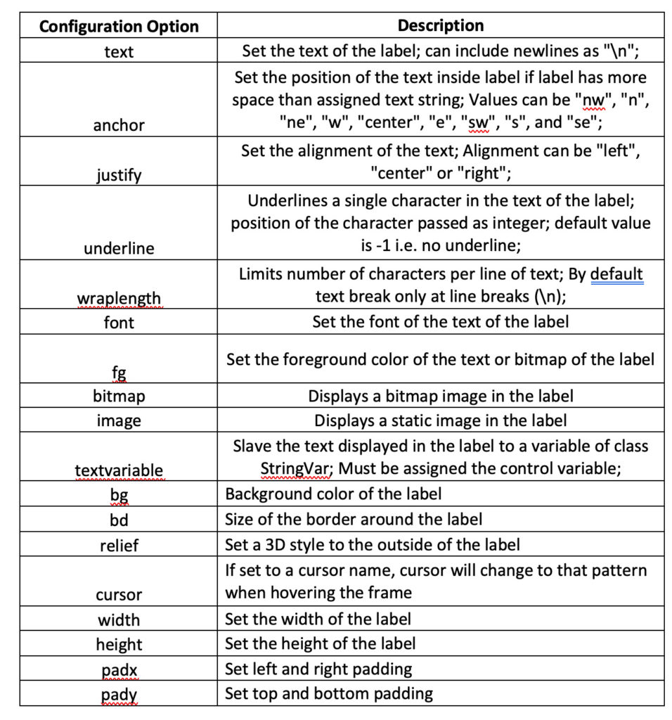
A frame object has these configuration options:
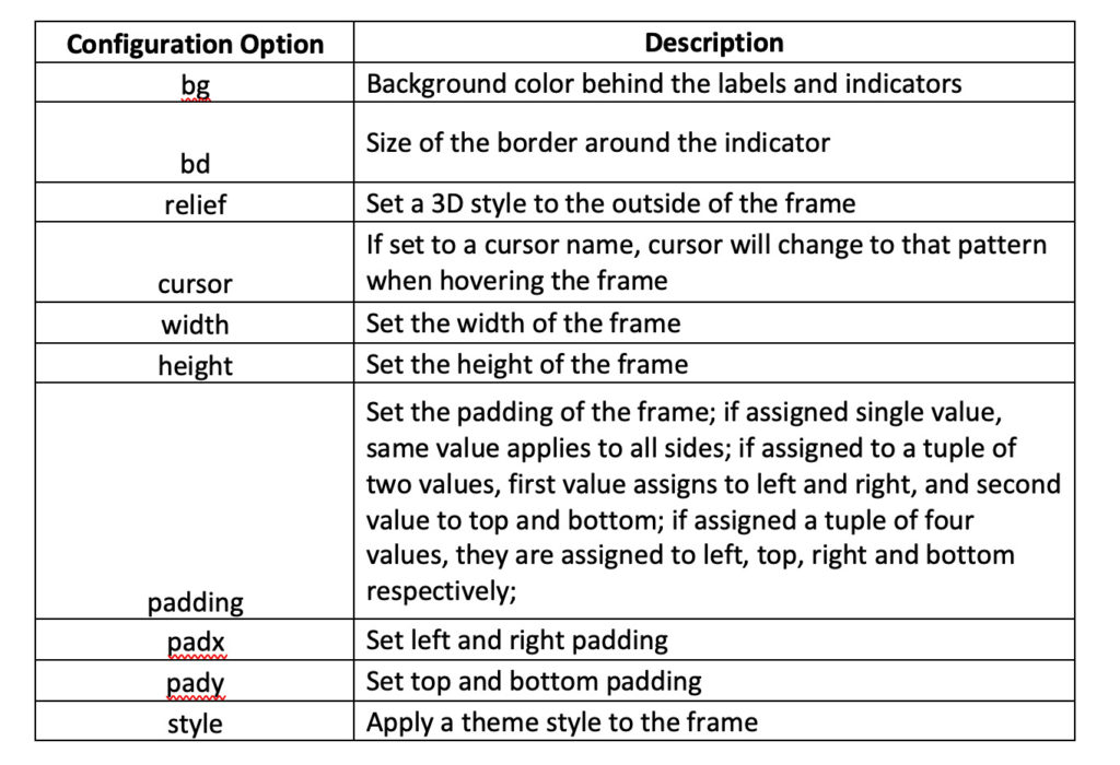
Colors (like bg) in Tkinter are assigned as strings, which can be hexadecimal values for colors (like “#fff”, #fdfdfd, etc.) or color names (like “red”, “blue”, “green” etc.).
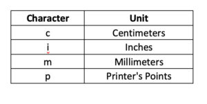
It should be noted that all dimensions (border width, padding, etc.) defined as an integer will take on a pixel value. Dimensions can be assigned a unit by suffixing the value with the following indicators:
 By default, frames have no borders. If a “bd” attribute is given a value and a “relief” attribute is given a value (other than flat), the frame will have a border with that width and style. The relief attribute determines the border style.
The relief styles supported in Tkinter are flat, raised, sunken, groove, and ridge. If the frame has a relief style assigned as “flat,” its border will not be displayed.
Mouse cursors supported in Tkinter include: arrow, circle, clock, cross, dotbox, switch, flower, heart, man, mouse, pirate, plus, transport, scaling, spider, spray can, star, target, tcross, walk and clock. The default cursor is “arrow”.
Frame configuration options can be defined as key-value pair arguments in the frame definition or can be set explicitly. Here are two valid examples of setting configuration options for a frame:
LED_def = Frame(root, padx = 25, pady = 10)
LED_def.grid
or
LED_def = Frame(root)
LED_def.grid
LED_def(“padx”)= 25
LED_def(“pady”)= 10
Frames serve only as container widgets for other basic widgets and do not involve event binding.
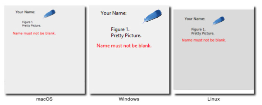
Label – serves as containers for text and images. The text inside a label can be updated or changed. Generally, labels are used to indicate the purpose of other widgets in the interface.
The labels look like this:
A label can be created by instantiating a label object. A label object can be instantiated using Tkinter's Label method or the ttk class. The definition of a label object has this syntax:
var = Label(parent, (configuration options,….)
Here is a valid example for creating a label:
label_LED_gpio = Label(LED_def, text = “Select GPIO”) # LED_def is the name of the parent window or frame
The parent of a label object can be the main window, a child window, or a frame. A label object has these configuration options:
The font of the text on a label can be specified as a tuple where the first element must be the font family and the second must be the font size in printer dots. Then there are other possible optional style modifiers, such as weight, slant, underline, or overstroke.
A font object can also be created after importing the Tkinter font package. A font can be created by instantiating a font object using this syntax:
Font1 = font.Font(options,….)
The options are:
- Font family – standard, platform-specific, or a named font
- Font size – in printer dots
- Weight – normal or bold
- Slant – roman or italic
- Underline – set to “1” for underlined text or “0” for normal text
- Overstrike – set to “1” for overstrike text and “0” for normal
In a font definition, font family and font size are mandatory options and the rest are optional. After creating a font object, it can be assigned the font attribute of any widget. This is a valid example of creating and using a source object:
from tkinter import source
labels_font = font.Font(family='Helvetica', size=12, weight='bold')
label_LED_gpio = Label(LED_def, text = “Select GPIO”, font=labels_font)
You can also show a bitmap or a static image on a label. Bitmaps available in Tkinter include: error, hourglass, information, guesthead, question, warning, gray75, gray50, gray25, and gray12.
If the bitmap is assigned a label, text will not be displayed in it. Instead, the bitmap is displayed in place of the text. The font of the text on a label can be specified as a tuple, where the first element must be the font family and the second must be the font size in printer dots. There are also other optional style modifiers, such as weight, slant, underline, or overstroke.
A font object can be created after importing the Tkinter font package by instantiating a font object using this syntax:
Font1 = font.Font(options,….)
The options are:
- Font family – standard, platform-specific, or a named font
- Font size – in printer dots
- Weight – normal or bold
- Slant – roman or italic
- Underline – set to “1” for underlined text or “0” for normal text
- Overstrike – set to “1” for overstrike text and “0” for normal
In a font definition, font family and font size are mandatory options and other options are optional. After creating a font object, it can be assigned the font attribute of any widget. This is a valid example of creating and using a source object:
from tkinter import source
labels_font = font.Font(family='Helvetica', size=12, weight='bold')
label_LED_gpio = Label(LED_def, text = “Select GPIO”, font=labels_font)
To include a static image, Tkinter's Python Image Library (PIL) or its recent version, Pillow, must be imported. However, the PIL package does not come bundled with Python. Therefore, you will have to install it by running the following command in the shell (Bash shell on Raspberry Pi):
pip installation pad
This statement can import the PIL or its updated version, called Pillow:
from PIL ImageTk import, image
Next, you will need to create an image object using the PhotoImage method of the ImageTk class. The image object must be assigned its image attribute. Here is a valid example of including an image in a label:
from PIL ImageTk import, image
myimg = ImageTk.PhotoImage(Image.open('minhaimagem.png'))
label = label(root, image=myimg)
label.grid
To open an image in an image object, this syntax can also be used:
myimg = ImageTk.PhotoImage(file = 'minhaimagem.png')
Tk supports GIF and PPM/PNM images. Tk 8.6 also supports PNG images. After installing PIL, support for many other image formats (such as BMP, JPEG, PNG, TIFF) is also included.
When using PIL/Pillow, images can be filled into labels or as a canvas that is a child of the parent window or a child of a frame within the parent window. However, PIL/Pillow does not populate images beyond this hierarchy. For example, it cannot fill images in a frame within another frame, which is a child of the parent window.
The text of a label can be linked to a variable using the textvariable attribute. This way the text can be updated or changed in the code. This is a valid example of binding the text of a label to a variable of type StringVar:
from tkinter import *
from tkinter import ttk
def function:
global variable
var.set(“The text has been changed!”)
root = Tk
root.title (“Dynamic label text”)
root.minsize(200, 200)
var = StringVar
label = label(root, text variable = var, padx = 50, pady = 50)
var.set(“Click the button to change the text of this label”)
label.pack
button = button (root, text = “Change text”, command = func)
button.pack
root.mainloop
Labels serve as containers for text and images, which are used to indicate the functionality or purpose of other widgets. But you can still bind mouse events to them.
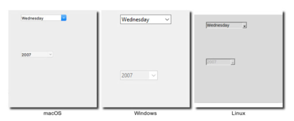
Combo box – comes from the ttk package. It displays a list of text values from which a user can select one.
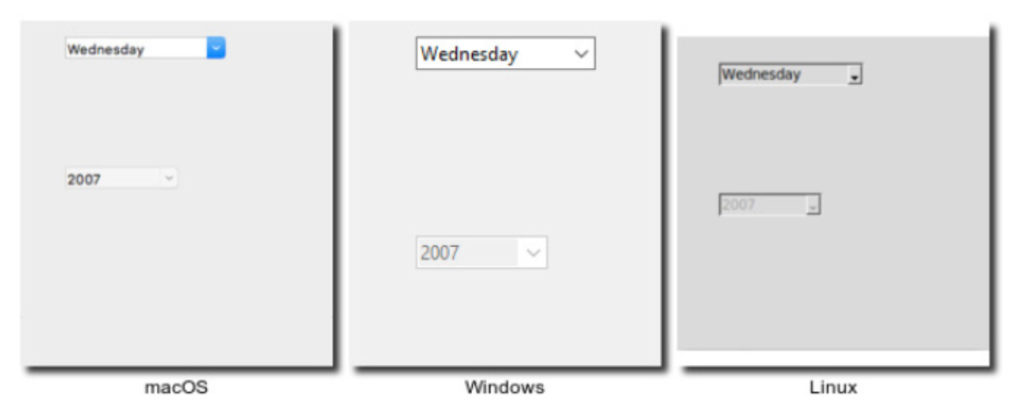
The Combobox looks like this:
A combobox can be created by instantiating the combobox object. A combobox object can be instantiated using the Combobox method of the ttk class. The definition of a combobox object has this syntax:
var = ttk.Combobox(parent, (configuration options,….) #ttk is a reference to the ttk class
This is a valid example of creating a combo box:
combo_LED_config = ttk.Combobox(LED_def, values=(“Source Mode”, “Sink Mode”))
The parent of a combobox object can be the main window, a child window, or a frame. A combobox object has these configuration options:
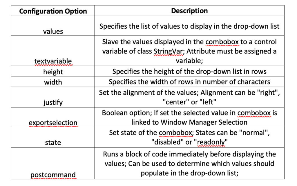
The values of a combo box can be specified by a Python list or tuple. You can also dynamically populate values in a combo box using the textvariable attribute. Values can be strings or numbers.
The combo box is used to allow the user to make a selection from a list of values (text or numeric). You can also bind keyboard and mouse events with a combo box. However, the most important thing is a virtual event associated with it. This virtual event is “<
A default value can be selected from the combo box using the current method on it, with the index of the desired value passed as an argument. Because the values in a combo box are taken from a list or tuple, the index starts at “0”.
If the current method is used without arguments on a combobox object, it returns the index of the currently selected value, or “-1” if no value is selected. The get method returns the currently selected value from the combo box. The set(value) method allows you to set the selected value of the combobox to the value that is passed as an argument.
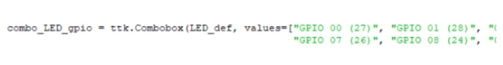
In the following example, we can populate the GPIO pins of the RPI using a combo box.
Other methods available for the combobox object include: cget , configure , verify , instate , and state .
The combobox is a subclass of Entry. From the Entry class, it inherits the bbox , delete , icursor , index , insert , selection and xview methods.
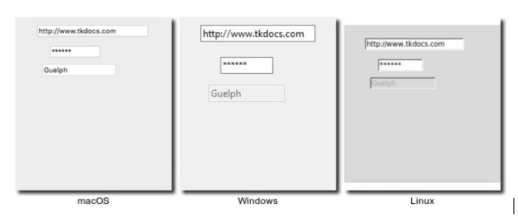
Input – accepts a single line of text string from the user.
It looks like this:
An entry can be created by instantiating an entry object using Tkinter's Entry method or the ttk class. Defining an input object has this syntax:
var = Entry(parent, (configuration options,….)
This is a valid example of creating an entry:
input_LED_duration = input(LED_def)
The parent of an input object can be the main window, a child window, or a frame. The input object has these configuration options:
 Inputs are used to obtain numeric or single-line text input from a user. The numeric or text value entered by the user can be retrieved using the input's get method. A callable can be bound to the Input for any change in its state (the state of the Input's content — not the state of the widget) by assigning this to the command attribute.
Typically, a callable is linked to input via the command attribute for data validation. Keyboard or mouse events can be bound to an input using the bind method. In this case, the callable (event handler) will have the event as one of its arguments.
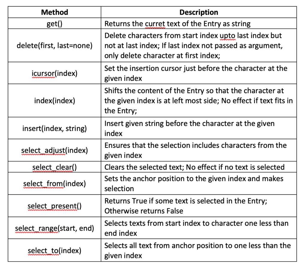
These methods are available for the Input widget:
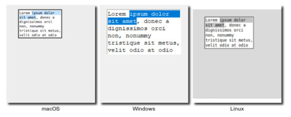
Text – accepts multiline text from a user as a string object.
It looks like this:
A text widget can be created by instantiating the text object. The text object can be instantiated using Tkinter's Text method or the ttk class. The definition of a text object has this syntax:
var = Text(parent, (configuration options,….)
This is a valid example of creating a text widget:
text_cLCD_message = Text(cLCD_init) #cLCD_init is the name of the parent frame or window
The parent of a text object can be the main window, a child window, or a frame. The text object has these configuration options:
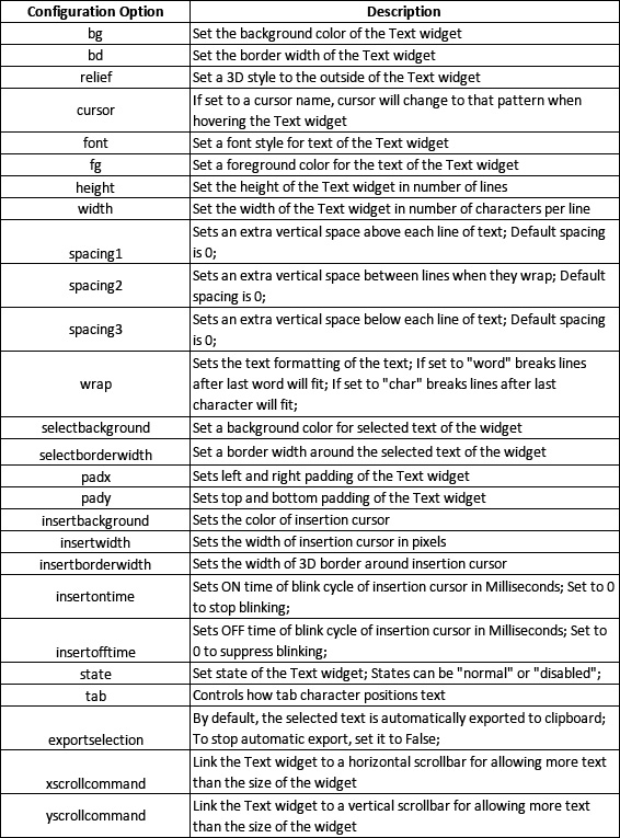
It should be noted that the text widget does not have command and text variable attributes. Multiline text entered by the user in the Text widget can be retrieved using the get method. Keyboard or mouse events can be bound to a text widget using the bind method. The text widget supports some auxiliary structures like Tabs, Tags and Table of Contents that are useful in formatting the text content. The following methods are available for the Text widget:
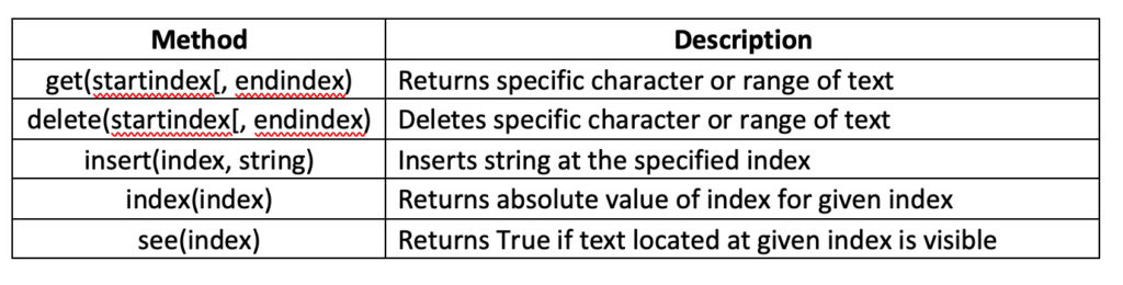
The text widget has additional methods for tabs, tags, and table of contents.
The text widget index has the format line_number.character_position. Therefore, “1.0” refers to the character in position “0” on line “1”.
Keywords — such as linestart, lineend, insert, end, wordstart, wordend, and chars — can be used as an index or part of the index.
For example:
- “2.2 linestart” refers to the first character of line 2
- “2.2 lineend” refers to the new line at the end of line 2
- “2.0 + 3 characters” refers to three characters beyond line 2… and so on
Check button – allows the user to select values for an option, which can be more than one at a time. These buttons contain binary values that a user can toggle. When the user toggles the value, a command callback can be invoked.
The check buttons look like this:

A Checkbutton can be created by instantiating the Checkbutton object. The Checkbutton object can be instantiated using Tkinter's Checkbutton method or the ttk class. The definition of a Checkbutton object has this syntax:
var = Checkbutton(parent, (configuration options,….)
This is a valid example of creating a Checkbutton:
animation_flag = StringVar
check_cLCD_animate = Checkbutton(cLCD_int, text = “Animate Text”, command = cLCD_Text_Animation, variable = Animation_flag) #cLCD_init is the name of the parent frame or window
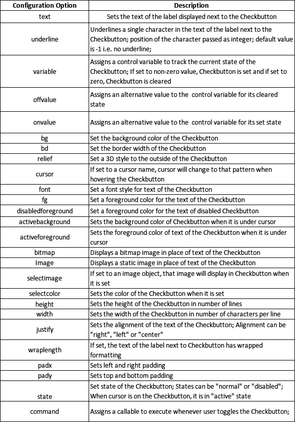
The parent of a Checkbutton can be the main window, a child window, or a frame. Checkbutton has these configuration options:
The Checkbutton can be set or unset all at once and paired with a variable to keep a check on its toggling state. By setting the “onvalue” and “offvalue” attributes, non-Boolean values can be retrieved when their state changes.
A callable can be assigned to your command attribute to execute code behavior during user interaction. A callable can also be executed using the Invoke method.
There is no logic to bind keyboard or mouse events to a Checkbutton. However, mouse events can be bound to a Checkbutton using the bind method for some kind of graphical effect.
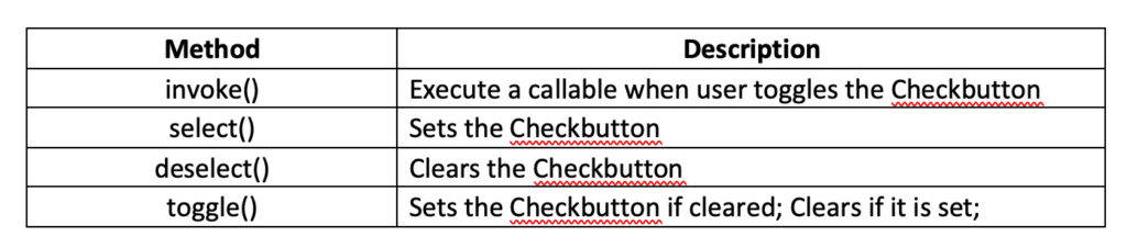
Checkbutton has these methods available:
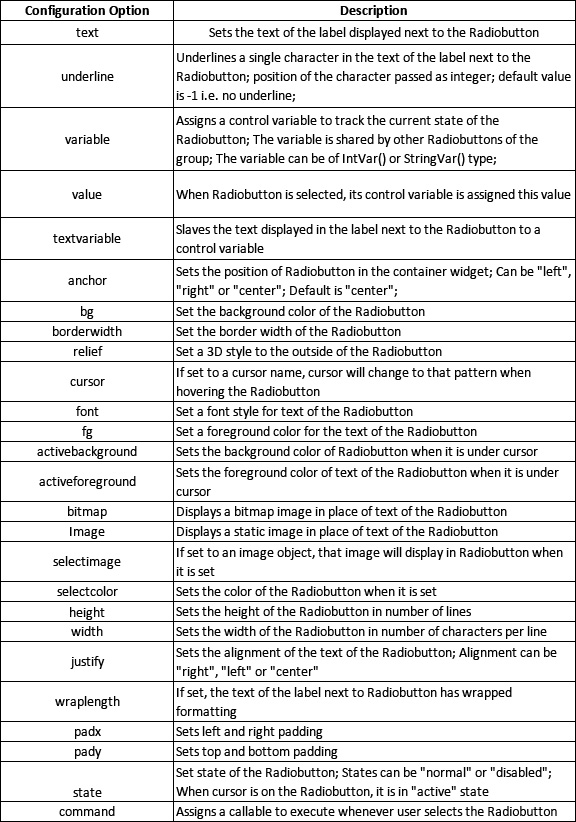
Radio button – allows a user to select just one value from multiple values for an option. This can be done by using the Tab key to navigate through the available values. A group of Radiobuttons must be associated with a single variable and each one must contain a unique value.
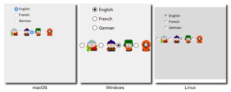
The option buttons look like this:
A Radiobutton can be created by instantiating the Radiobutton object. The Radiobutton object can be instantiated using Tkinter's Radiobutton method or the ttk class. The definition of a Radiobutton object has this syntax:
var = Radiobutton(parent, (configuration options,….)
This is a valid example for creating a Radiobutton:
watch_mode = StringVar
radio_datetime_mode = Radiobutton(watch_int, variable = watch_mode, text = “Display date and time only”) #watch_init is the name of the parent frame or window
radio_datetimetemp_mode = Radiobutton (watch_int, variable = watch_mode, text = “Display date, time and temperature”)
radio_datetime_temp_hum_mode = Radiobutton(watch_int, variable = watch_mode, text = “Display date, time, temperature and humidity”)
The parent of a Radiobutton can be the main window, a child window, or a frame. Radiobutton has these configuration options:
Additionally, the control variable can track the status of a Radiobutton and can contain a numeric or string value assigned to the selected Radiobutton. Code behavior can be added to a Radiobutton object by assigning a callable to its command attribute.
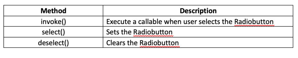
It is also possible to execute a callable using the Invoke method. However, it makes no sense to bind keyboard or mouse events to a Radiobutton using the bind method, although some mouse events can be used to animate certain graphical effects on a Radiobutton.
Radiobutton has these methods:
Button – allows users to perform certain actions. You can display text or images on buttons to indicate their purpose. Buttons are associated with a callable that must be executed when a user presses it.
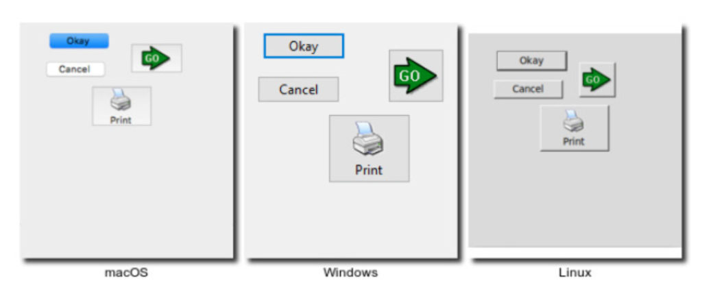
The buttons look like this:
A Button can be created by instantiating the Button object. The Button object can be instantiated using Tkinter's Button method or the ttk class. The definition of a Button object has this syntax:
var = Button(parent, (configuration options,….)
Here is a valid example for creating a button:
button_LED_signal = Button(LED_def, text = “Generate Signal”, command = thread_generate_LED_signal) #LED_def is the name of the parent window or frame
A Button's parent can be the main window, a child window, or a frame. Button has these configuration options:
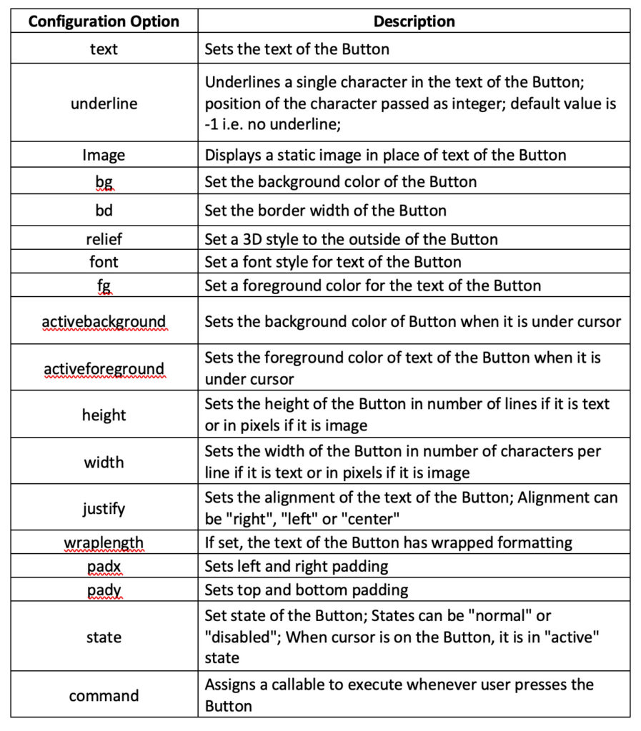 Code behavior can be added to a button by assigning a callable to its command attribute. A callable can also be executed using the Invoke method on the Button object.
By default, a callable should be executed when a user presses the button. There is no need to bind other keyboard or mouse events to a Button object. However, it may be useful to bind some keyboard events to a button using the bind method when you need to perform an action via keyboard shortcuts.
We can design most of the interfaces for our RPi recipes with these widgets. If we include any other widgets in our recipe GUI, we will display them then.
In the next tutorial , we will discuss Tkinter/ttk menus, layout management, event binding, and multithreading. This will be enough to test our first Raspberry Pi recipe – an LED driver.
Do it yourself
If you have experience with microcontrollers, try to guess the use of different Tkinter/ttk widgets in controlling embedded operations. For example, we can use a scale widget to control the duty cycle of a PWM signal or to control the speed of a DC motor.
We can also use the Entry or Text widgets to contain text messages that can be passed to a character LCD by pressing a button. Based on your experience with microcontrollers, think about situations where you might use different Tkinter/ttk widgets in embedded applications. Also, keep in mind situations where you might be reading sensor data.
Try to evaluate these situations and the possible difficulties you may face when using Tkinter/ttk widgets to control different hardware components.
One example is that the Text widget does not have a “text variable” or command attribute. In this case, will it be possible to pass dynamic text messages from a Text widget to a Character LCD? Start brainstorming!